RSS

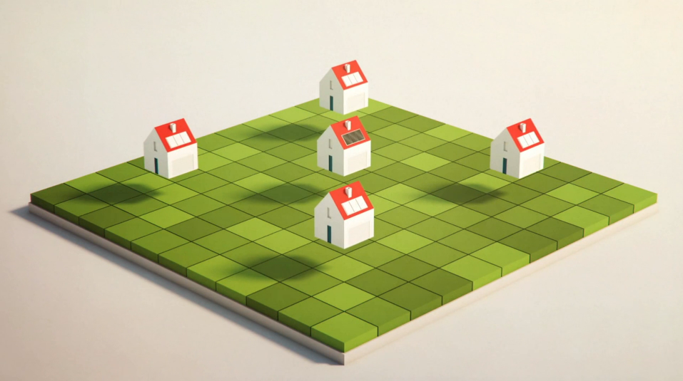
Sebas & Clim create an informative film for Hackney council. The infographic is simple and uncluttered, but with subtle careful animation create a visually appealing video.

Flat coloured 2D animation but cleverly animated to give a 3D feel. A warm colour scheme and soft shapes give it a welcoming feel.
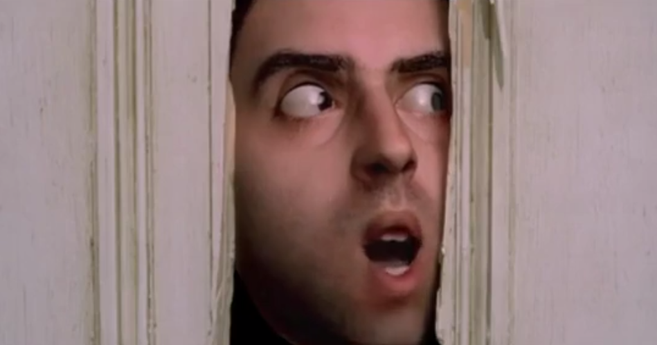
Music video, using CGI and tracking to image map the singer’s face on to famous film clips.
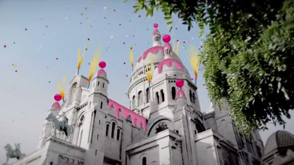
Hand drawn cartoon elements tracked on to nicely shot footage of Paris, gives a friendly upbeat feeling to an urban landscape.
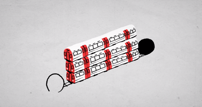
Hand drawn simple animation, with ink and paper depict a cut-down TED talk, by Moth Collective.
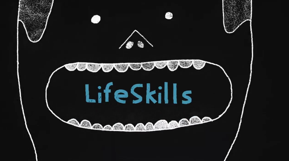
Chalk board style animation by Art & Graft, describing one boy’s experience using animation of chalk lines and clever transitions.
Title design for Pixar’s Up by Janice Ahn. Colourful and playful with quantised colouring to give it a modern graphic feel.
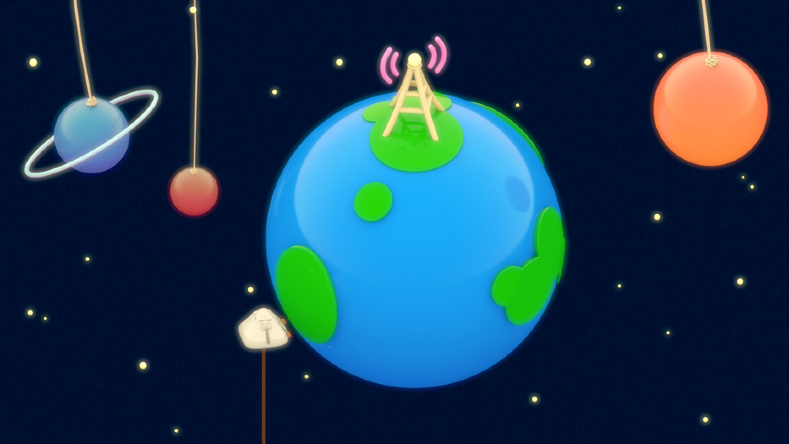
An isometric style animated short film with glossy plastic texturing which has character moments and infographic moments. Lovely colours and lighting.
Model mock ups by Rural Lee for a film for IKEA. The film would have revealed a mini world inside each area of storage.
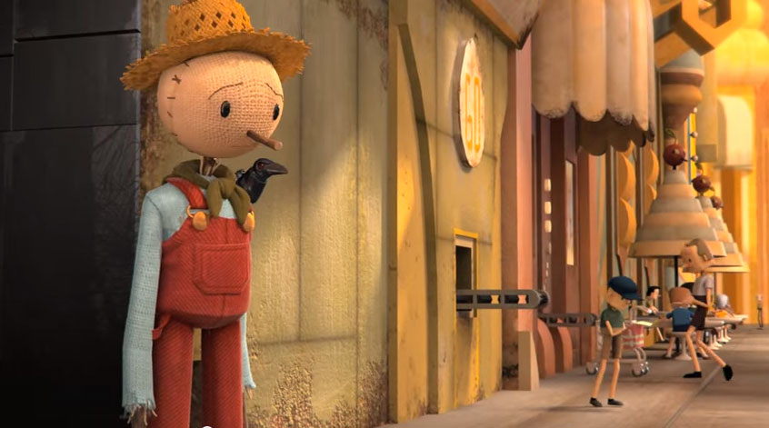
The team behind the hugely successful Chipotle film (watch it here) are back with a new film in shiny CGI. All big budget stuff here.
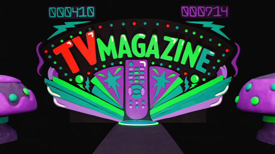
A Big mixture of CGI, stop motion, animation and live action seemless mix in this crafted advert for the Sun.
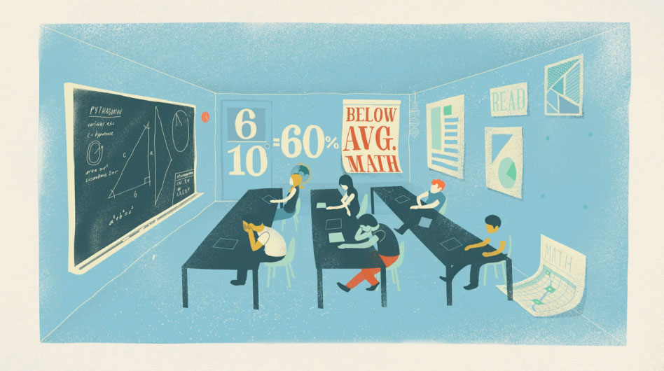
Charming infographic using alot of animation to state of the pressures of education in Idaho. A nice mixture of hand drawn animation and transitions give the film a very different look.
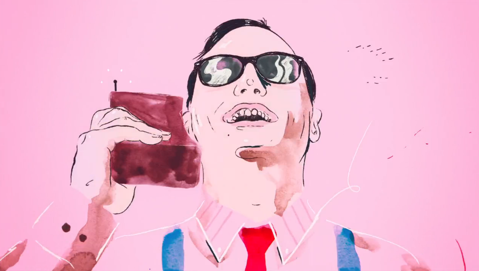
An 80’s themed ident, using painterly effects and smooth animation, give it modern reworking of an 80s style ident.
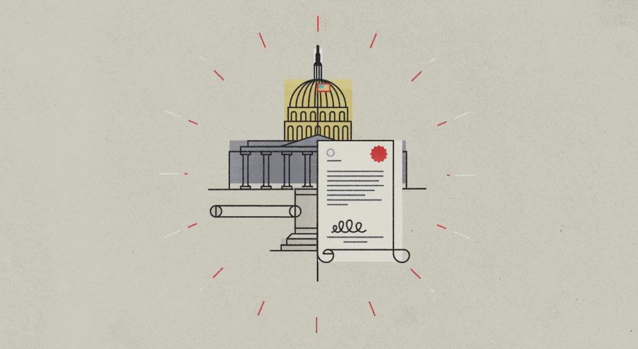
Another infographic but with a slightly more illustrative linear feel to it, with lovely transitions. The Voice over provides the facts and the visual is much more abstract.
An infrographic about Live video animations delivered via instagram. The colour palette and condensed font give a very modern look with slick animation.
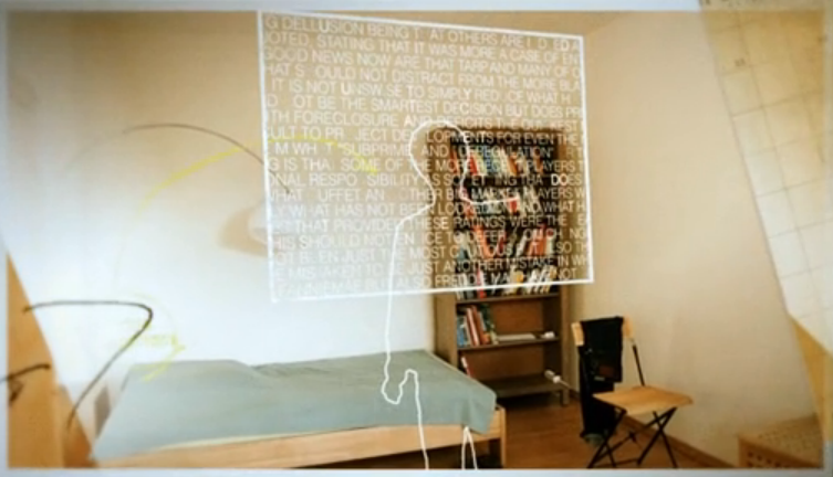
Looks like Rubicon but with a figure orchestrating. Another animation from Marcus Eckert.
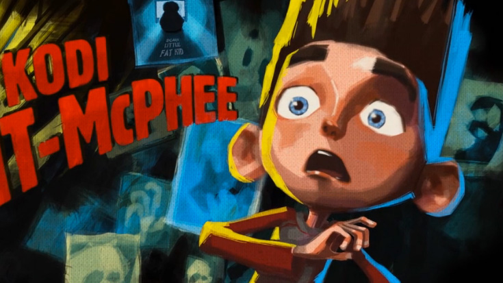
A subtle mix of 3D into the retro spooky styling by using painted textures on the 3D models. The look is spooky with an old film feel.
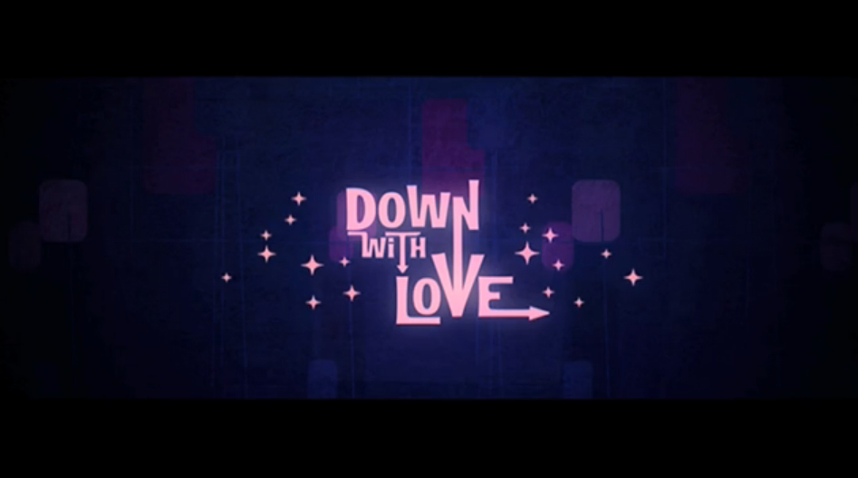
Retro style graphics in a 2D graphic style contributes a swinging soundtrack. A fifties style animation similar to Catch Me if You Can.
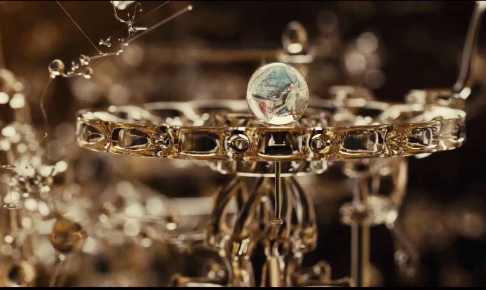
Titles by Dvein, fromthe Spanish film director Kike Maíllo’s retro-futuristic sci-fi thriller.
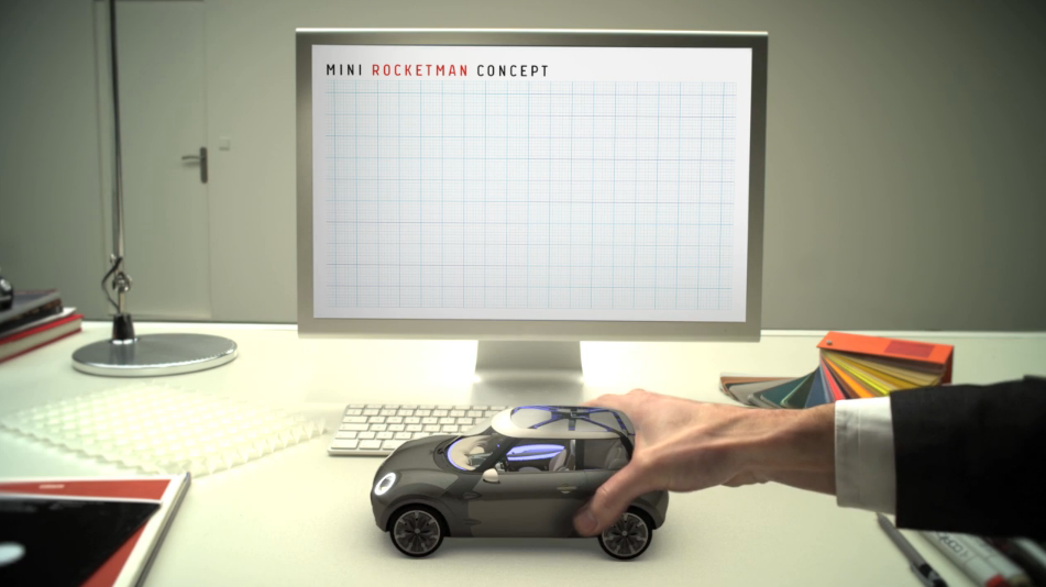
Plenty of ideas in this one from pop up books to 3D tracking, all explaining the new mini, all as a model on an inventor’s desk.
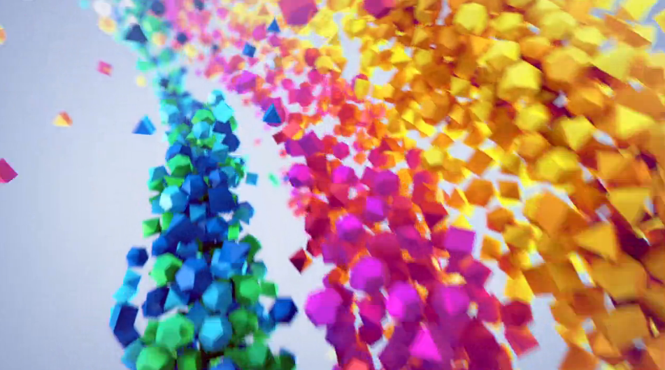
Rainbow colours in 3D forms characterise this animation by Production Studio: Ars Thanea, Director: Karol Kolodzinski & 3D Artist: Patryk Habryn.
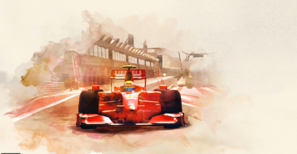
lots of watercolour washes bring in the video which itself has been treated with the watercolour look.
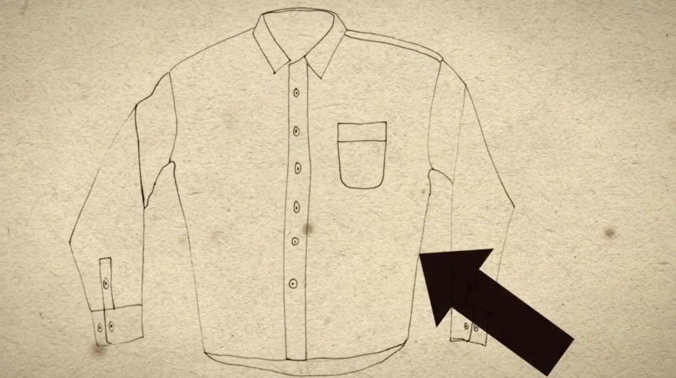
Yes slavery is still with us in some parts and this film questions our role in that trade. From Daniel Stewart working with Epipheo studios and Kasey Lum.
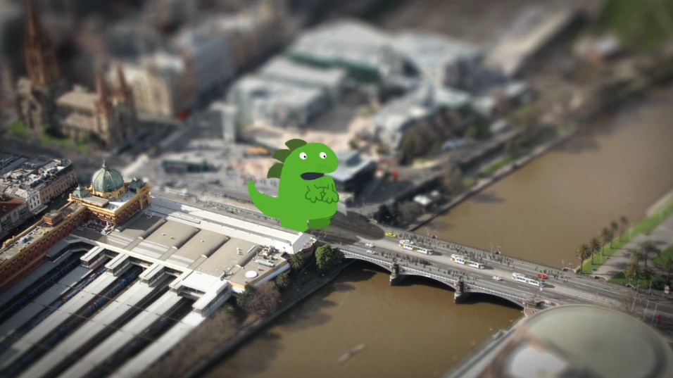
Short animated film by Philip Watts combining ’tilt shift’ cityscapes, traditional animation and some great little visual effects. Beware of the little green monster.
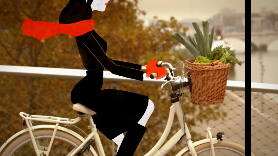
A great hybrid of traditional animation and live action from ‘Les Telecreateurs design’. One can only imagine that this was quite a complex piece of work to composite as successfully as this.
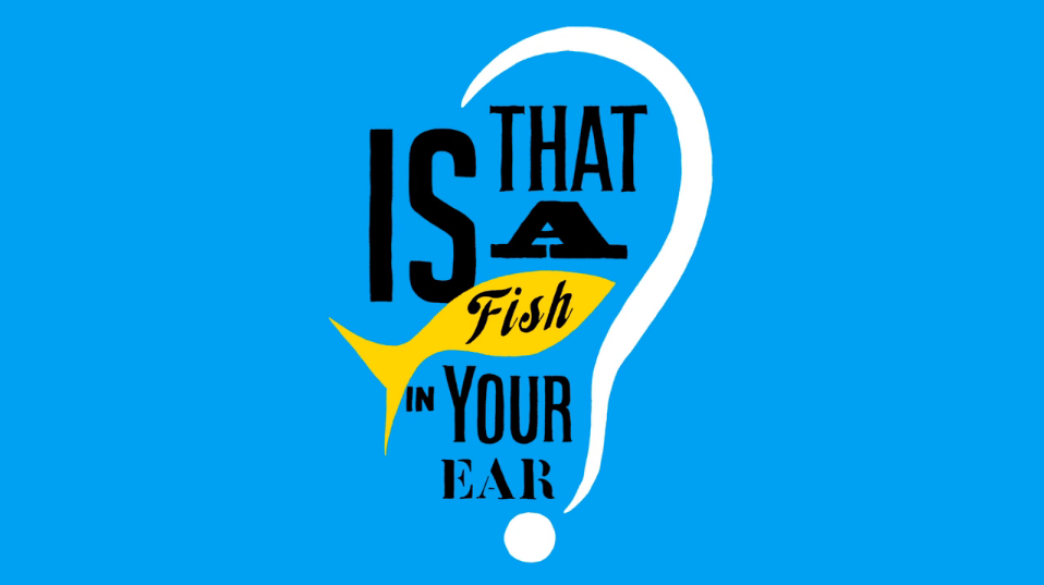
A short animation made for Penguin Books to help promote ‘Is That A Fish In Your Ear?’ by David Bellos. Animation by Matthew Young.
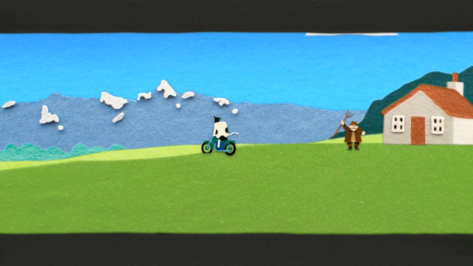
We’re just about to embark on a project involving use of fuzzy felt and came upon this directed by Tony Mines for Tandem Films in Homage to the Steve McQueen motorbike sequence from ‘The Great Escape’.
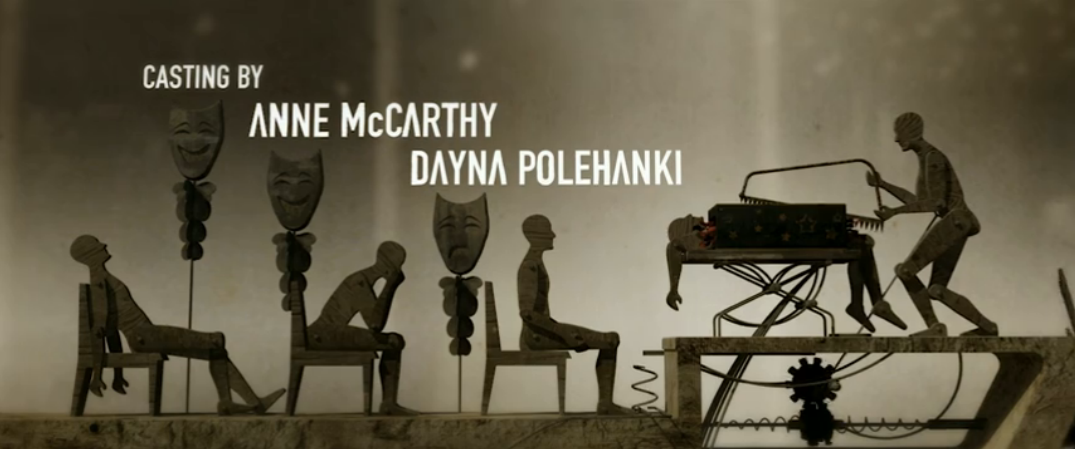
Charles de Lauzirika’s psychological noir is the subject of this end sequence where wind-driven, humanoid whirligigs are torn apart and re-purposed into disturbing wooden mechanisms.
NOTE: Sorry we are unable to embed the sequence. Please click on this link.
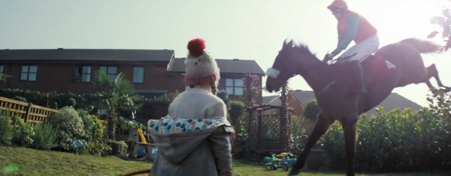
John Allison and Chris Bovill, Creative Directors of 4creative where the drivers behind the 45 hours of footage, shot over two days using 44 cameras and a cast and crew of almost 300 people, including race and stunt horses and jockeys to achieve the ambitious final film.
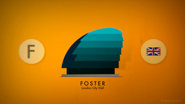
Very much has the feeling of an old 50’s animation. Concept and Animation: Andrea Stinga, Federico Gonzalez.

A Short Animation Inspired by the Works of İlhan Koman with video and sound design by Candas Sisman. Its quite hypnotic once it gets going.

Nice little infographic animation from Binalogue on the launch of the British Council’s social media strategy pack.
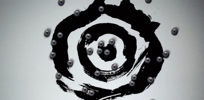
Beautiful abstract film celebrating the OFFF festival of design, photography and motion
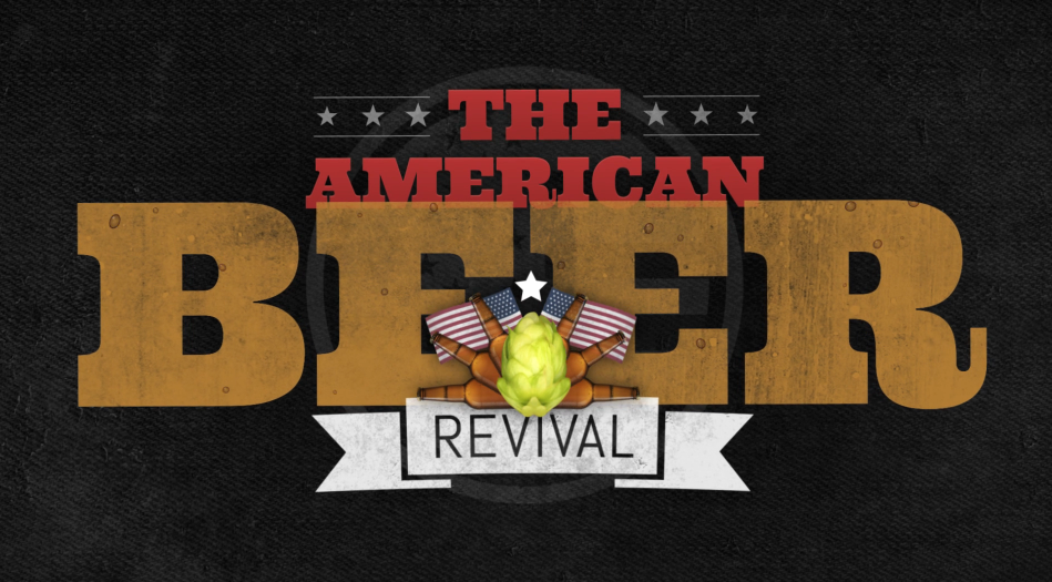
Solely text leads this short conveying facts about the American brewing industry. The nicely placed text and font choices manages to keep the interest.
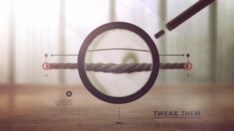
A lesson in transitions here, using 2D motion graphics composited and interacting with 3D elements for a trailer for an arcade game app.
An info-graphic film but holds very little statistics in terms of text and numbers, mostly relying on transition graphic imagery to convey the details.
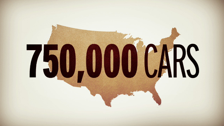
Designed, animated and written by Chris Harmon to highlight the massive oil spill in the Gulf which so quickly left the news and we largely forgot about.
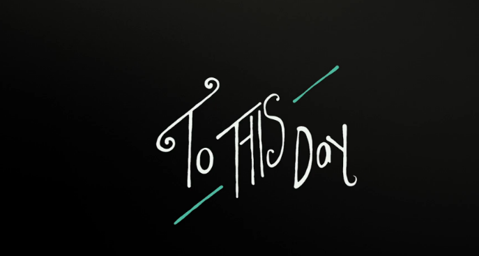
To This Day is a project based on a spoken word poem written by Shane Koyczan called “To This Day”, to further explore the profound and lasting impact that bullying can have on an individual. Animators and motion artists brought their unique styles to 20 second segments that will thread into one fluid voice.
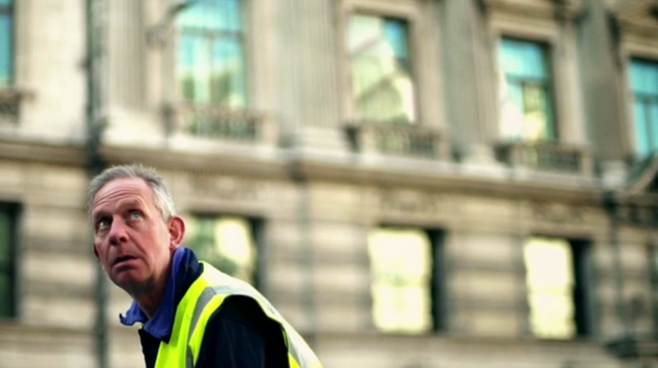
Really well captured insight into the Greenwich community and the return of the Cutty Sark after it has been restored after the fire which almost destroyed it some years ago. Apparently the work is from Armoury London and the compositing was done by Rogue Collie in Wales.
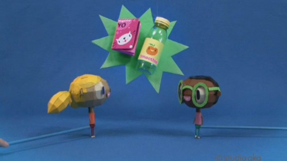
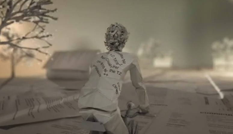
A charming film by Grant Orchard using papier mache and lo-fi props to make this hand-made cardboard video on recycling.
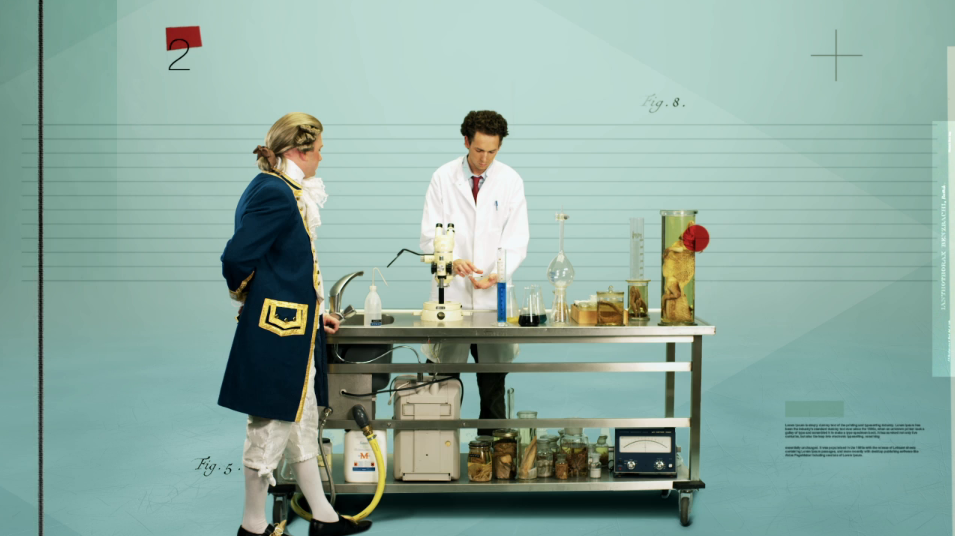
An interesting mix of styles combining the foundations of a studio shoot with lots of overlaid graphics informing the viewer about the collections and work of this Dutch centre for biodiversity studies. Agency – PlusOne
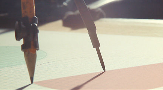
A nicely shot and animated homage to the individuals who have produced landmark titles for features in the past.
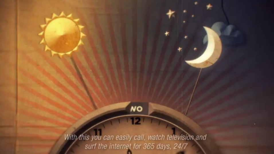
Quirky German animation with George Melieres overtones. Direction and animation: Jeroen Houben & Jurjen Versteeg.
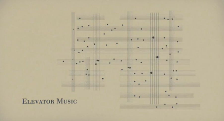
Simple, in style and colour animation but with clever technicalities and expertly executed.
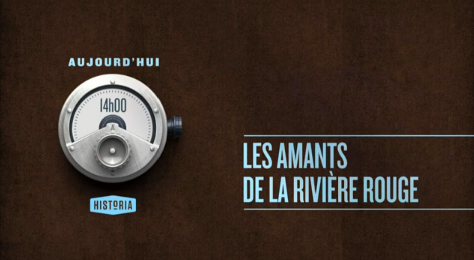
Idents and branding for the French History channel. Very subtle but with some very nice clever features to it, especially with the show times towards the end.
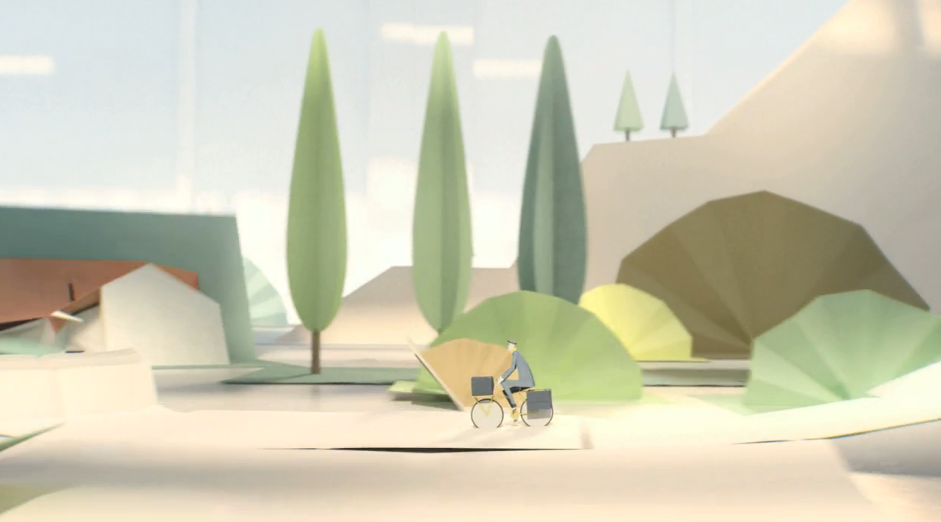
Another use of 3D unfolding card, getting more and more complex. A small world is unraveled in a small fresh colour scheme with wonderful camera movements.
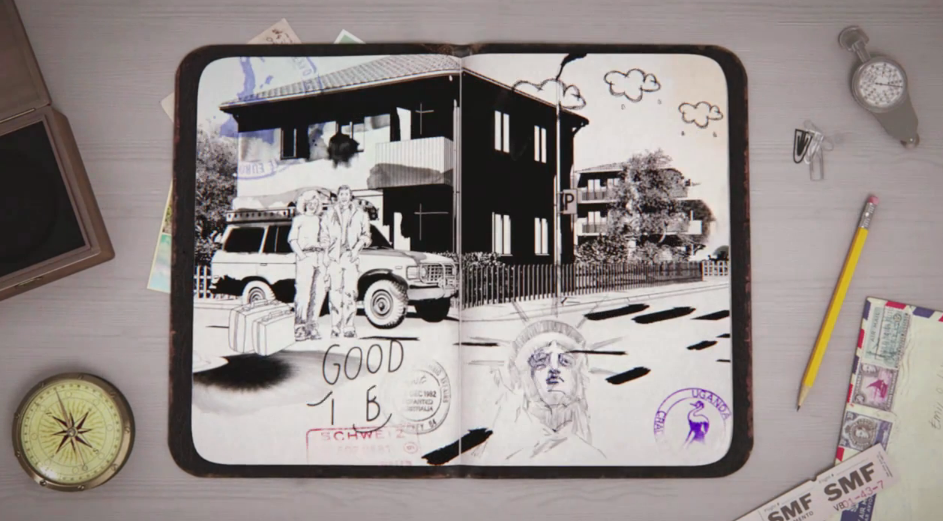
Telling the story of a Toyota, the “open book” idea is used again, but with ink and more of a travel guide. The apply a variety of techniques on a standard theme as the video progresses.
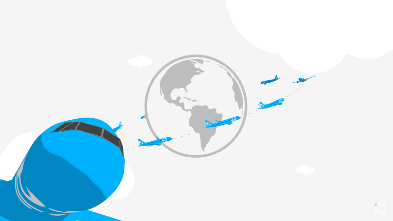
A great little promotional video from Binalogue, relating the pleasures of Planet IFE an inflight entertainment & advertising company.
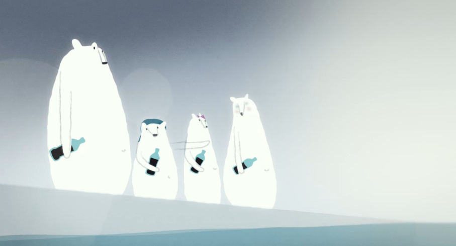
Nice mix of 2D animation with 3D to give a flawless subtle look. Simple and subdued it warns of the health issues with certain fizzy drinks.
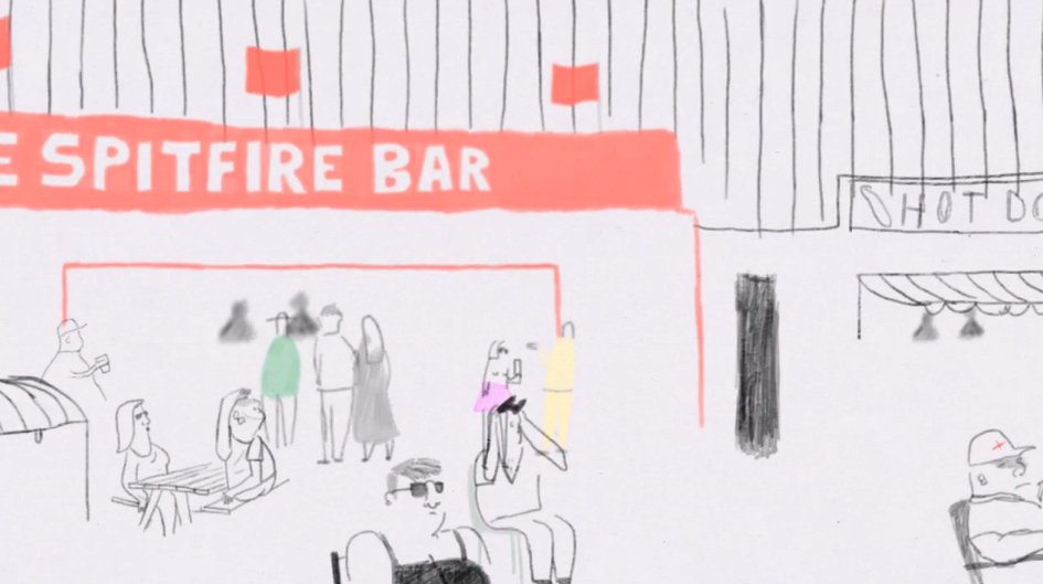
Quintessentially British film from the Royal College, animating line drawn illustrations.
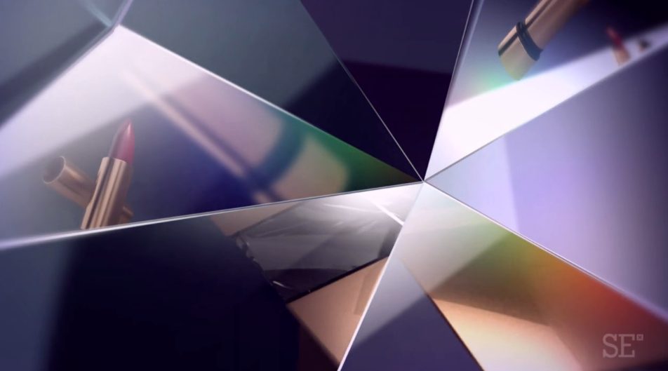
Branding idents for the tv channel with a high female demographic. Shiny things, lipsticks, handbags, all that stuff girls like.
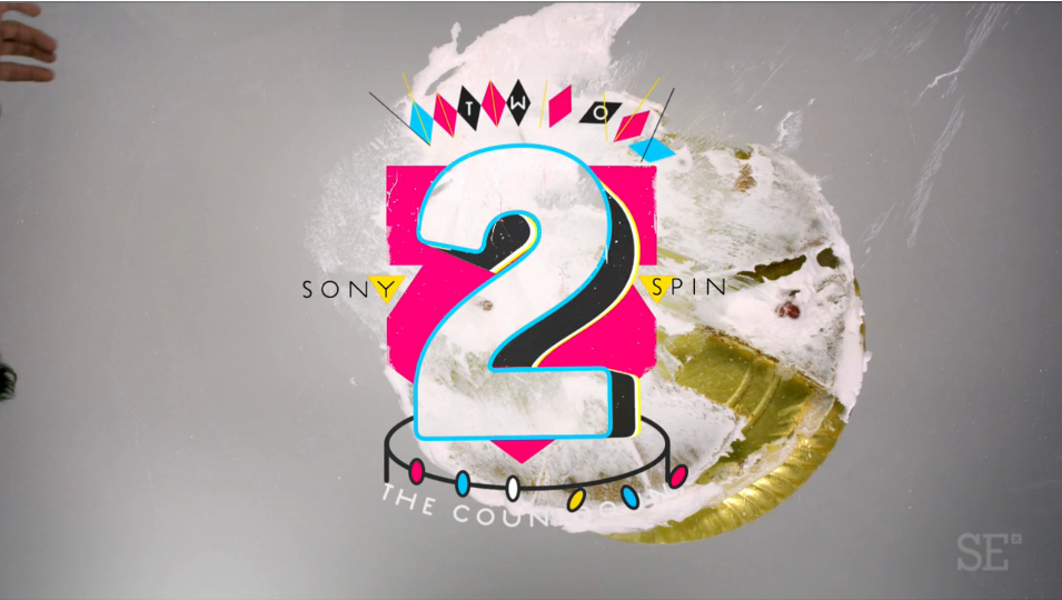
Mixing simple live action with animation to create 10 small colourful numerical idents.
Quirky puppet style animation added a comical twist to the outrageous expenses scandal. Illustrative styling and cut out photos allowed a mix real people without being too liable for Channel 4.
[flowplayer src=’http://td-sketchpad.com/wp-content/uploads/2012/11/Dispatches-MPExpensesClip.mp4′ width=485 height=272 splash=’http://td-sketchpad.com/wp-content/uploads/2012/11/Screen-shot-2012-11-28-at-11.04.20.png’]
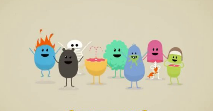
A find by Mr. Rob Edmonds about rail saftey using quirky block coloured 3D animation to give a graphic flat traditional styling.
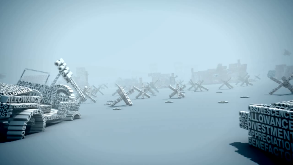
This is an amazing piece of work. The camera movement, depth of field, modelling and explosions work really well.
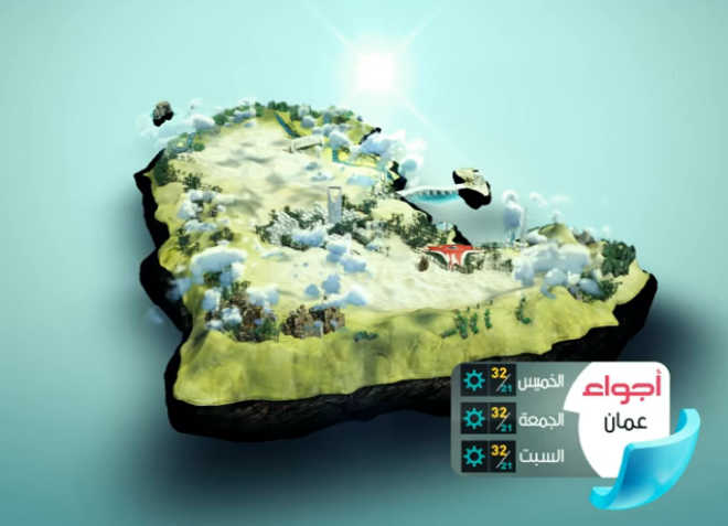
Not sure you really need weather forecasting for the Arabian Gulf, but if you did this is the one.
A test by us to showing parallaxing a an old photograph celebrating the queens jubilee in Bethnal Green. The photo is split into layers, digitally repainted and then placed into a frame with a 3D virtual camera.
[flowplayer src=’http://trainordaviesdesign.com/wp-content/uploads/2012/06/RunningGirlsTestFramedsmall1.mp4′ width=485 height=272 splash=’http://trainordaviesdesign.com/wp-content/uploads/2012/06/Screen-shot-2012-06-06-at-16.07.56.png’]
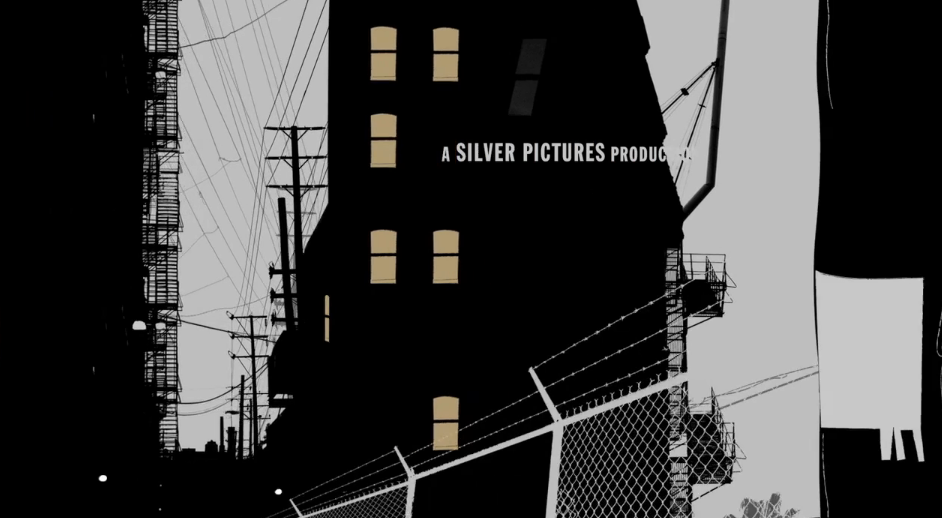
Animation for the opening of Kiss Kiss Bang Bang starring Robert Downey Jnr. The titles use simple mattes and strokes to create an old painted effect, with more focus on the style rather than the animation.
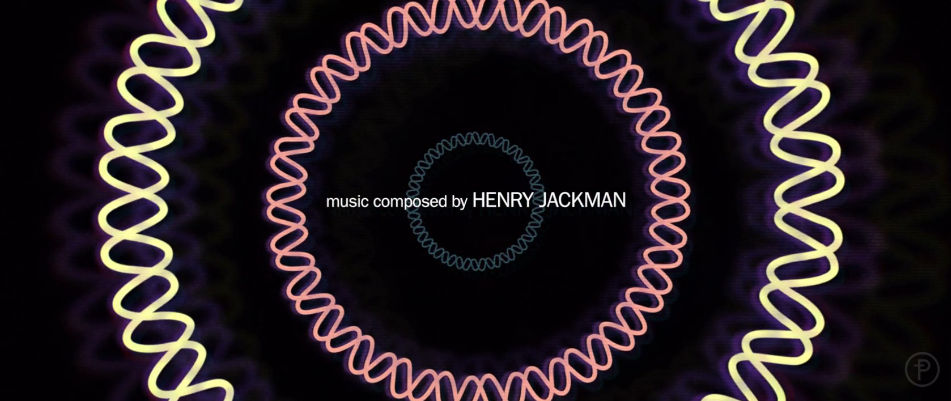
End titles for the film. Referencing early 1960’s title sequences as inspiration, simple shapes are used to graphically represent scientific data including DNA sequencing, mitosis, meiosis, and gene technology.
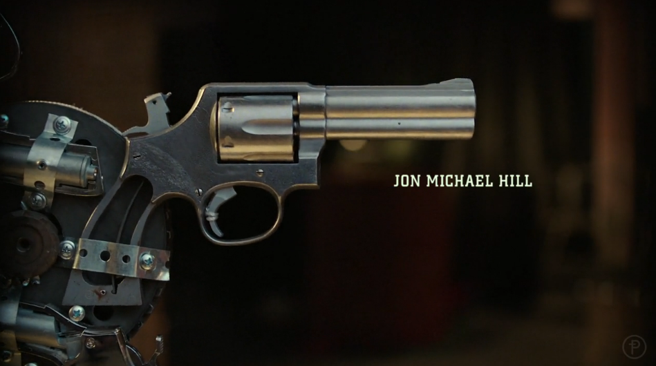
Prologue piece together a clever device shooting close-ups with a muted palette and short depth of field. The series is a modern take on Sherlock Holmes by CBS starring Lucy Liu as Watson. I know, right.
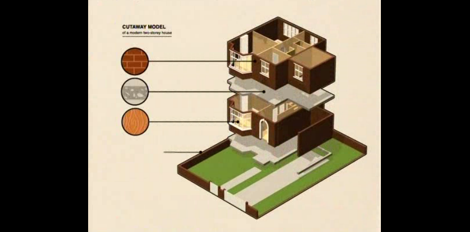
Another video looking like a 70s instructional manual, but nicely packaged and expertly done. I always like anything isometric.
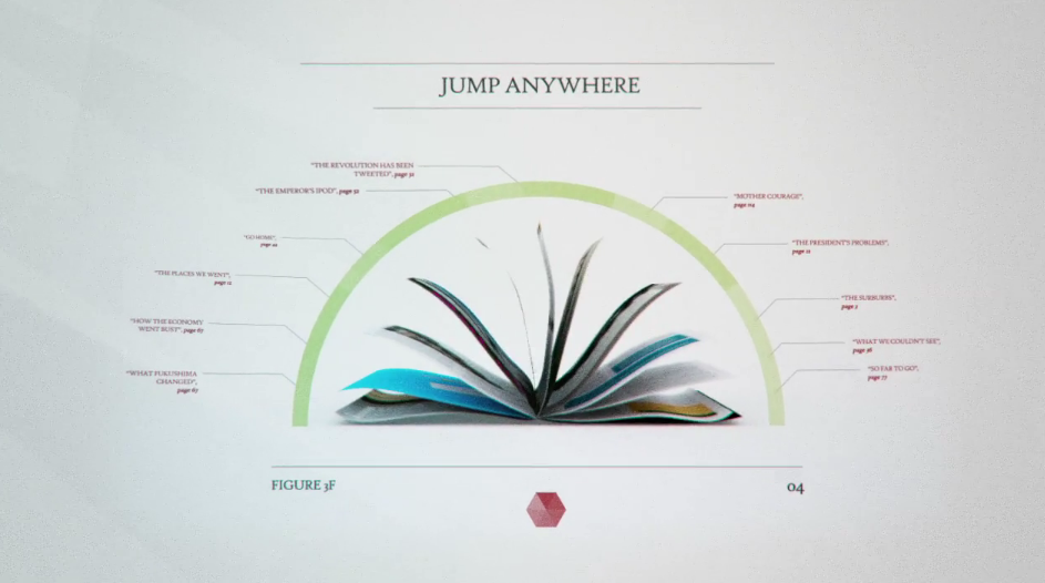
Nice combination of 2D and 3D to create a hi-tech styled commercial for a magazine app.
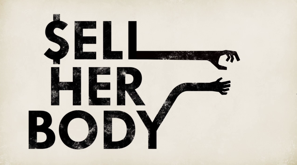
Infographic about the risk of AIDS/HIV in the third world. The film uses typography and simple graphics to tell the story.
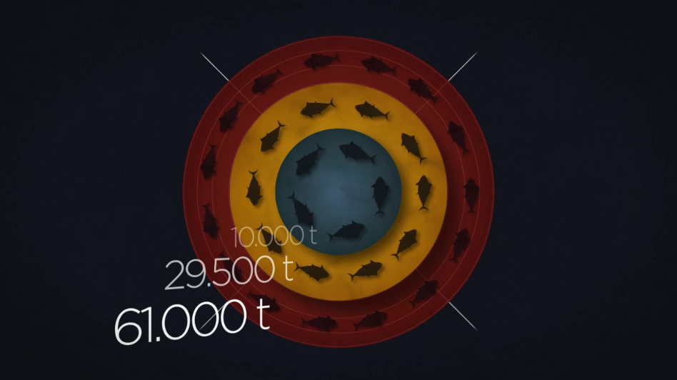
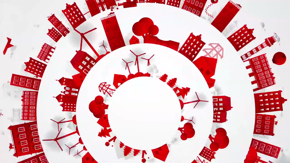
Infographic about environmentalism. Stylized CGI and clever transitional animation create a clear yet lovely backdrop for the information by Uli Henrik Streckenbach.
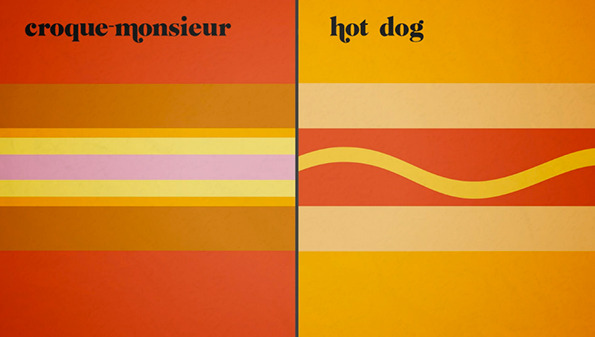
Animation based on Vahram Muratyan’s stunning book of illustrations, very flat simple and graphic and colourful.
By Nord
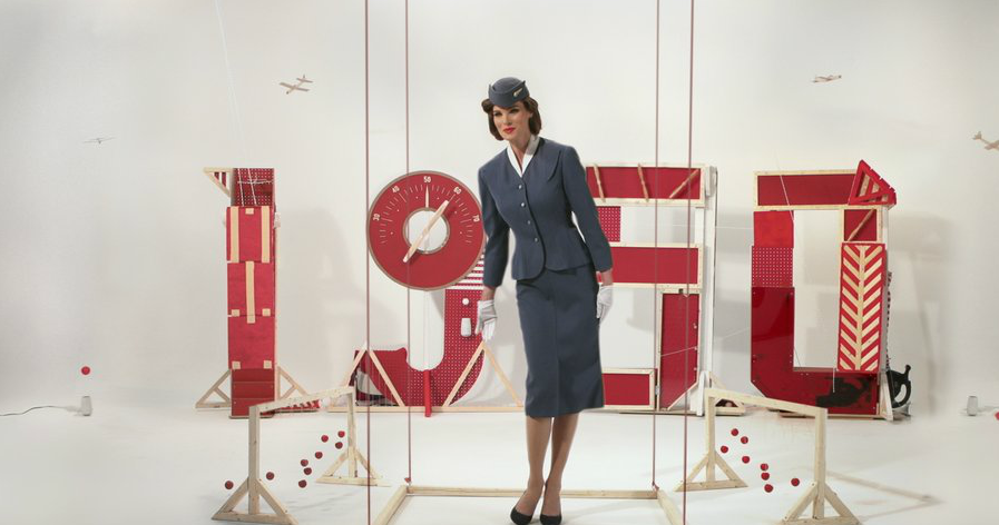
As far as i can make out most of this promo was achieved in camera with very little apparent past-production.
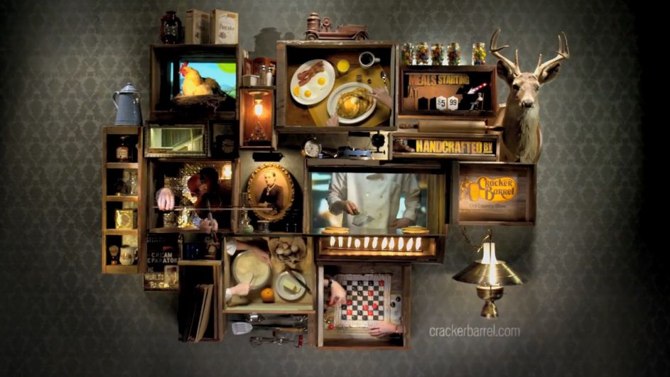
Clever use of super-imposing and tracking for this advert. Using boxes to separate action and have elements interact between them in a rustic setting.
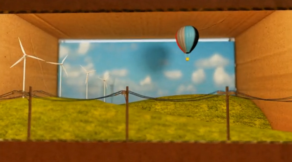
A cardboard diorama. Always nice. A simple model, with the softness of cardboard makes a industrial production process seem friendly.
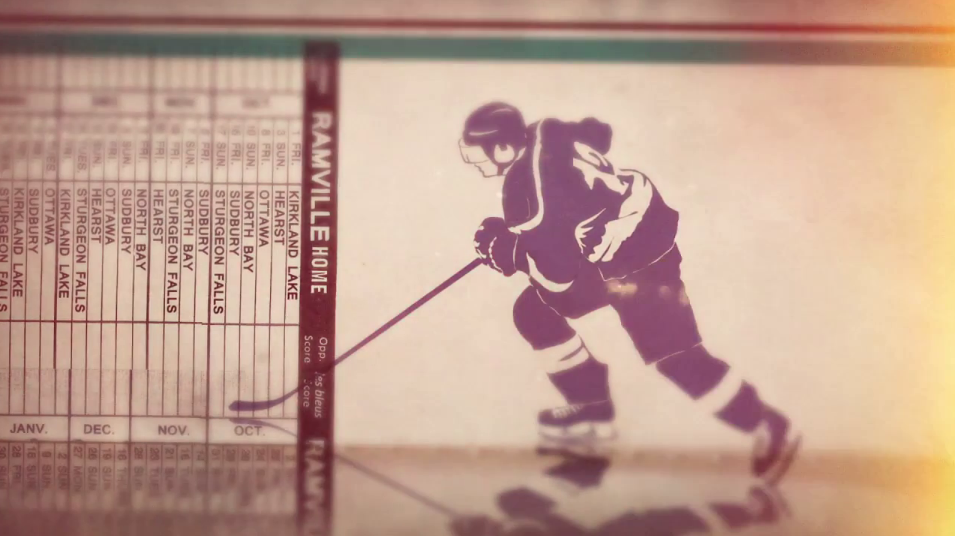
Nice title sequence using interesting motion on hockey notation and jump cut editing
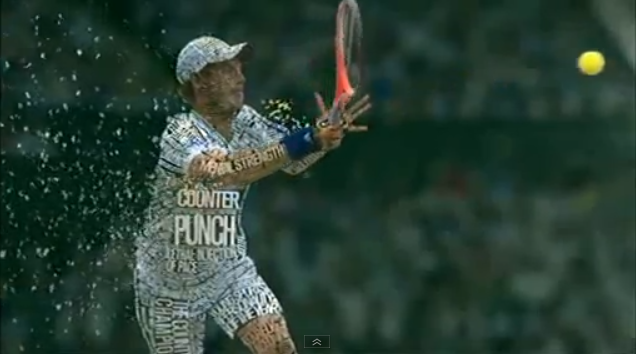
The new 2012 trailer for Wimbledon from Red Bee Media. Still trying to work out whether this this could have been achieved without painstaking attention to detail.
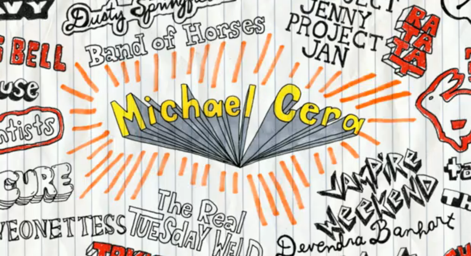
‘High School’ doodles animate in to provide a young naive feel to the hand-drawn titles.
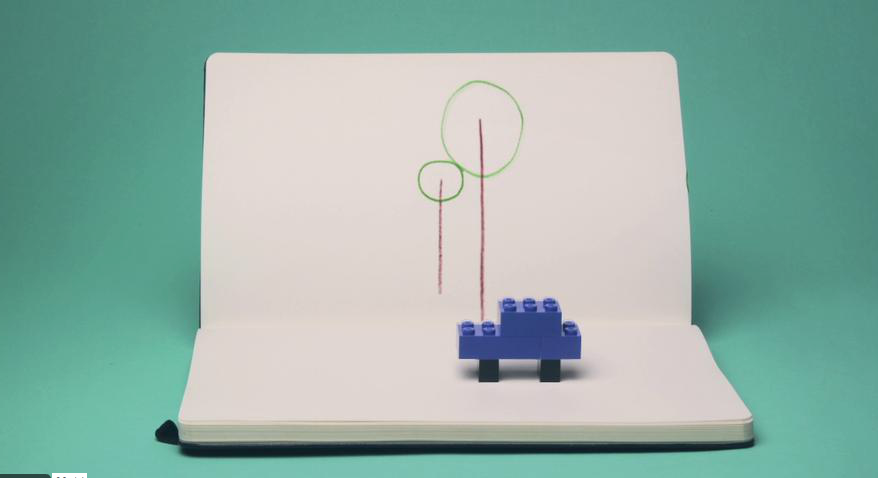
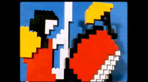
Simple animated lego characters sit on an environment of an animated moleskin background. Fun and quirky with simple but sophisticated animation.
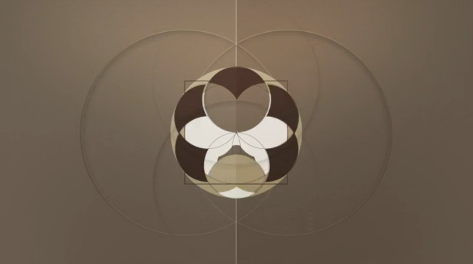
Demo reel for Sander can Dijk. Involves some nice kaleidoscopic 2D graphics and some 3D. Also a nice photo rip idea half way through.

Nice short film about the expansion to Oslo Airport. The film was made using small models of wood and cardboard to give it that handmade finish which is an interesting combination for a film about an airport expansion.
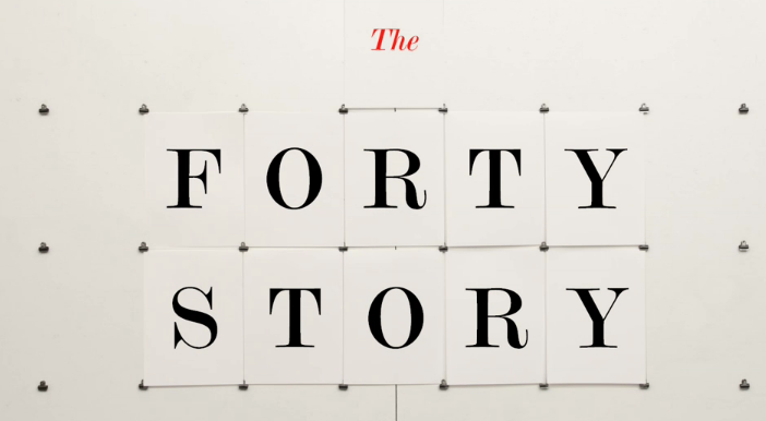
“The Forty story” is a short film which documents the work of Pentagram. Its carried by a clever audio track to accompany their history of print.
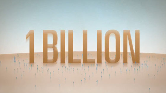
Great little animated piece especially if you denote all the ways the water icon is used
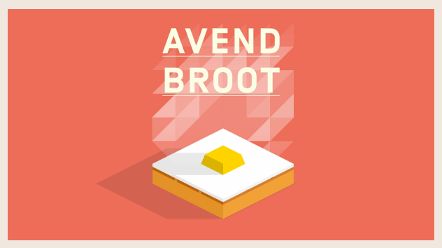
My weakspot, flat coloured isometric graphics. A couple nice transitions and I’m sold. Graphics, people, graphics.