RSS
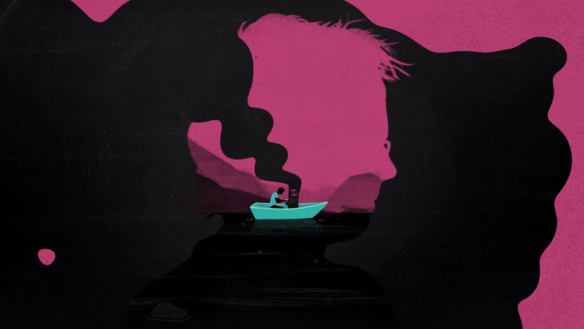
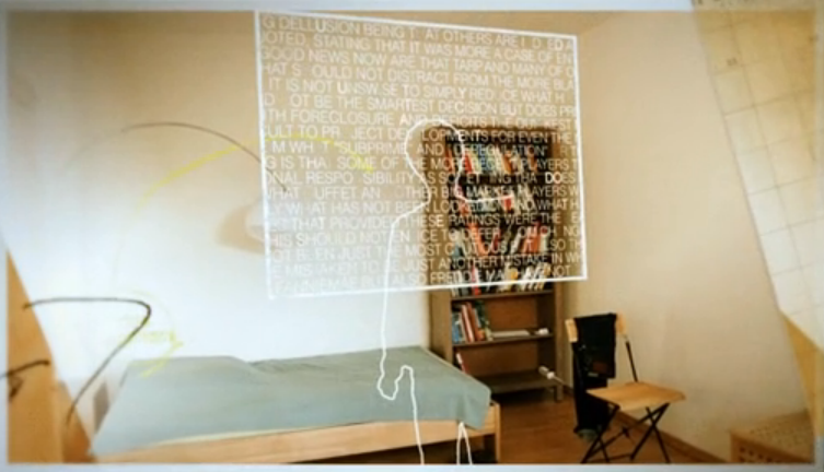
Animation from Bungalow revealing Rhodes a very personal musical memory from a room in a psychiatric hospital.
Chaotic spot for Tiscis sportswear collaboration with Nike called NikeLab x RT.
Directed by JN director Luca Finotti
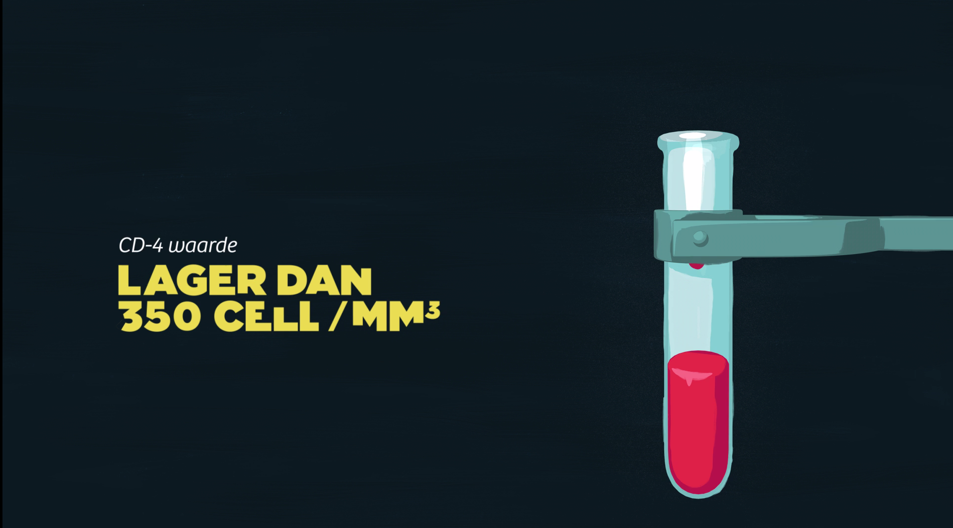
Film for Soa Aids Nederland. Part of the campaign to raise awareness about sexually transmitted infections and HIV among people living in the Netherlands from sub-Saharan Africa, Suriname, the Dutch Antilles and Aruba.
By PlusOne
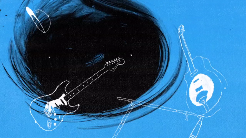
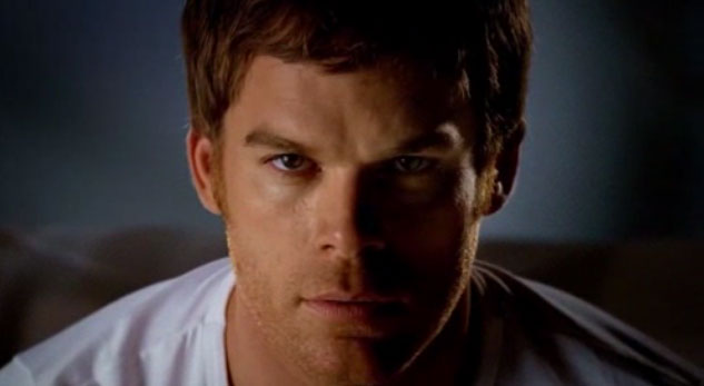
Great animation and great story about the rise to fame of Garratt. BBC Music commissioned ‘Contra‘ to tell the tale.
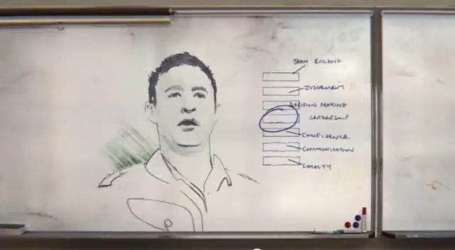
Series of animated documents made for a web documentary that tells the story of 5 young Syrian refugees who risked it all for a chance to start over. Treated stills and documents manage to sustain the long sequences.
Not the newest of films here, but the designers at Parallel managed to combine actual products with collage and simple figures within a cleverly lit scene to create a unique short commercial.
Excellent promo for Nike by ECD Jonathan Notaro and the Brand New School. It mixes drawn animation with CG elements to produce this gritty animation with a limited colour palette.
One of a series of promos for Ultimate Fighter on Fox using rapid editing and splashes of hand-drawn type and scratched elements. By State Design.
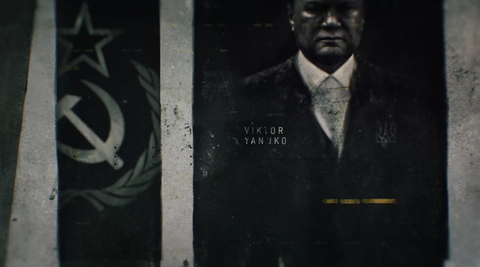
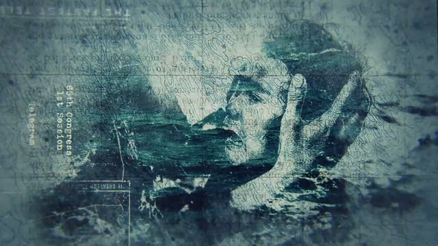
This title gets us up to speed quickly with the recent history of Ukriane, well at least how the story goes in the West. It’s another excellent piece of work from Patrick Claire
Been meaning to post this one for a while. It’s from Elastic TV. A great mix of the banal and the political.
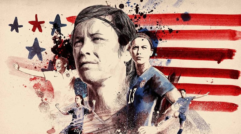
STATE Design‘s promo for the FOX Sports coverage of the 2015 Women’s World Cup in Canada featuring largely still images but animated into a superb mix with sketched lines and ink splashes and ooddles of humour.
Motion designer Christian Stangl has put this music video together for Strange Freedom´s track “Hide“ by means of thousands of single microscopic photographies, merged together, creating a dramatic timelapse scenario.
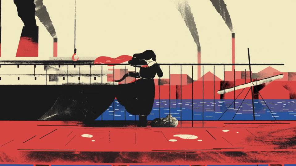
Beautiful animated film highlighting the work done by HIAS. Guided by the Jewish historical experience this organisation looks out for the plight of refugees.
Directed and Designed by Moth Collective
Produced by Sovev Media
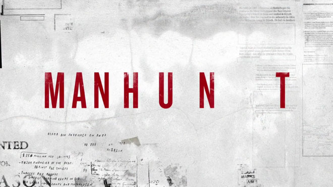
Opening Title sequence of HBOs Documentary; MANHUNT. The show documented the two decade hunt for Osama Bin Laden. Lots of documents and ink bleeds.
Creative Directed & Designed by Manija Emran.
Produced by The Mill+
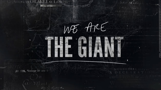
Lots of layers of political and social upheaval over the centuries are organised through what looks like a burning paper effect for the titles and graphics for director Greg Barker’s documentary, We Are The Giant, a Passion Pictures & Motto Pictures Production.
Creative Directed & Designed by Manija Emran. Produced by Mill Plus themillplus.com
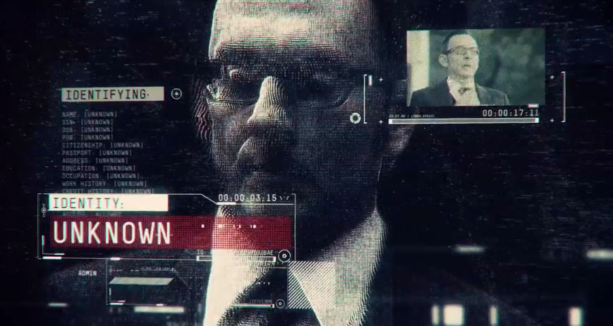
Essentially, spy stuff. Lots of overlays and tracking footage and data gives it that high-tech espionage look. By Imaginary Forces
Slight alteration to the aired version as the cross was taken off. Short and simple but nice idea with the flag transition. By Imaginary Forces.
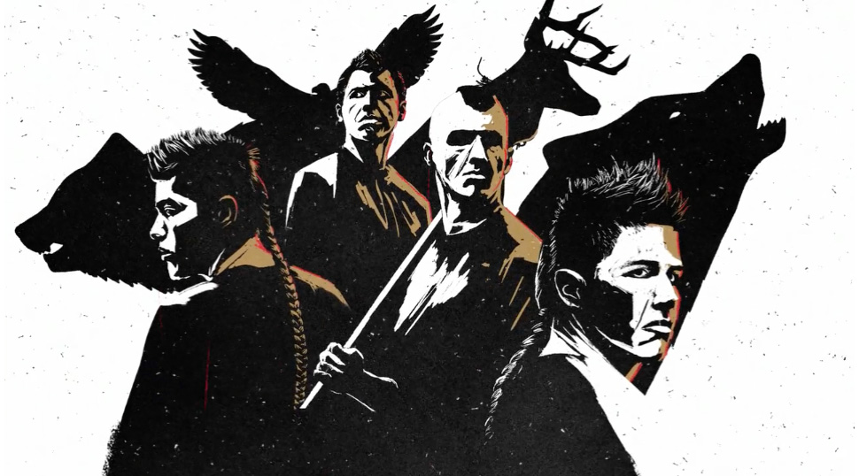
More excellent motion graphics from Antibody. Directed by Patrick Claire
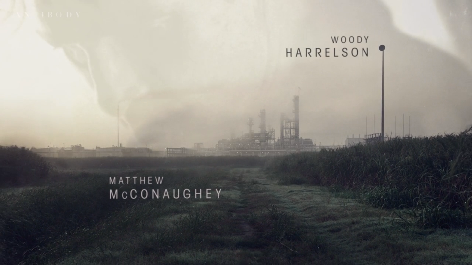
Antibody created the main title sequence for HBO’s critically acclaimed drama series True Detective. Working through our LA-based production partners, Elastic, and with compositing support from the talented crew at Breeder.
Textured and strongly lit animation bring a certain eastern european feel to this animation by Martin Zivocky.
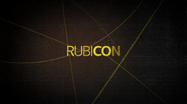
Looks like Rubicon but with a figure orchestrating. Another animation from Marcus Eckert.
Yes slavery is still with us in some parts and this film questions our role in that trade. From Daniel Stewart working with Epipheo studios and Kasey Lum.
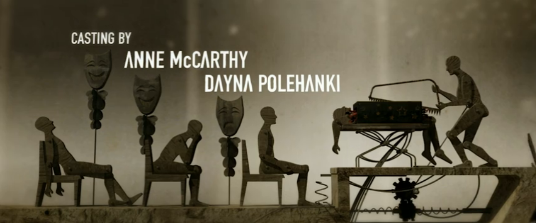
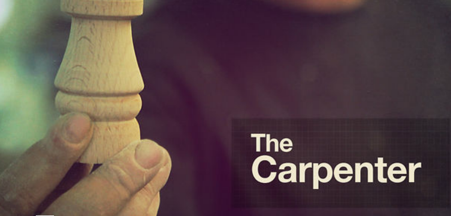
Charles de Lauzirika’s psychological noir is the subject of this end sequence where wind-driven, humanoid whirligigs are torn apart and re-purposed into disturbing wooden mechanisms.
NOTE: Sorry we are unable to embed the sequence. Please click on this link.

John Allison and Chris Bovill, Creative Directors of 4creative where the drivers behind the 45 hours of footage, shot over two days using 44 cameras and a cast and crew of almost 300 people, including race and stunt horses and jockeys to achieve the ambitious final film.
This is an amazing piece of work. The camera movement, depth of field, modelling and explosions work really well.
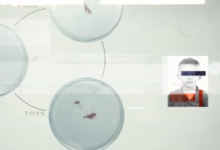
Infographic about the risk of AIDS/HIV in the third world. The film uses typography and simple graphics to tell the story.
Clever use of super-imposing and tracking for this advert. Using boxes to separate action and have elements interact between them in a rustic setting.
Nice bit of tracking and great cinematography but still slightly tongue in cheek – I think?
directed / edited / vfx – Dimitris Ladopoulos, Spiros Rasidakis
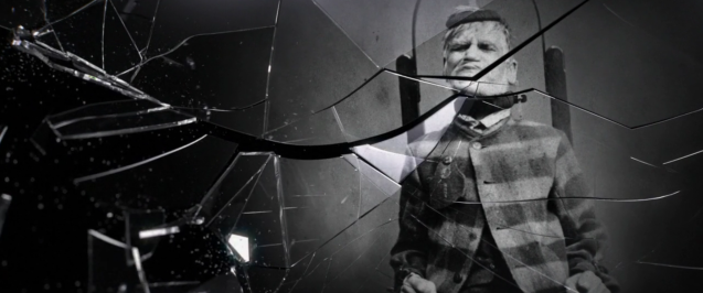
Titles incoporating archive stills by placing them against a plane of breaking glass. Not for the very squeamish…
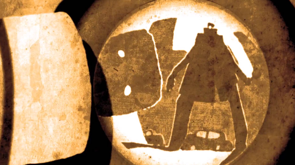
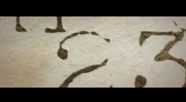
Title animation using purely motion graphics and clever transitions with a small colour pallete to great effect. Lots of documents.
What appears to be a great piece of motion capture was actually created using stills which were then applied to 3D models of human heads to create the idea of cameras moving around frozen action.
Static titles using close-ups of paper and documents with subtle animation to create a coded typographical sequence.
This sequence block shades the live action and adds it together with animation to create a very bold graphicly styled sequence.
Classic title sequence using live action footage placed carefully with credit typography
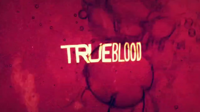
Classic Title sequence for True Blood. Using a mixture of archive and shot footage with a edgy heavily graded look. Thanks, Bolex.
[flowplayer src=’http://trainordavies.com/sketchpad/video/edwardianSuffragette2.mp4′ width=660 height=371 splash=’http://td-sketchpad.com/wp-content/uploads/2011/09/suffragette.jpg’]
We are most proud of managing to create an absorbing sequence which lasted well over a minute of tv time using just one photograph.
[flowplayer src=’http://trainordavies.com/sketchpad/video/unknownWarrior.mp4′ width=660 height=371 splash=’http://td-sketchpad.com/wp-content/uploads/2011/09/warrior.jpg’]
A very rough & ready ‘parallax sequence’ sequence mainly due to the fact that as this promo was not transmitted, the small source images came from ‘google’ but still it proves quite poignant.
A title we shot some years ago in my house in Wandsworth doubling as a US government office in the 30’s. We used a boroscope lens which was about a foot in length attached to a DigiBeta camera to get in to see that dust.
[flowplayer src=’http://trainordaviesdesign.com/wp-content/uploads/2010/12/amVoices.flv’ width=660 height=371 splash=’http://td-sketchpad.com/wp-content/uploads/2011/09/voices.jpg’]