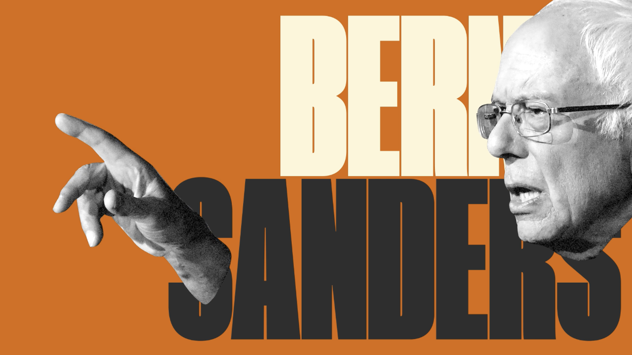
Gradient backgrounds with flowing American motifs, VICE News’ Election Show used a solid color scheme with blockier outlining. Instead of regal lettering, large impact font. Instead of classic smiling portraits of the sitting president and the opposing candidates, cropping them slightly off-frame for the slightly irreverent tone. The blunter Grapher scheme reflects VICE News’ Election Show purpose: To cut through the formalities and bromides to tell viewers what they need to know as frankly as possible.
Ana Simões, Senior Creative Director and Graphic Designer
Kazuyuki Ishii, Design Director
Kris Cave, Motion Designer
Category: Black & White, Geographical, Photography, political, Typography

